

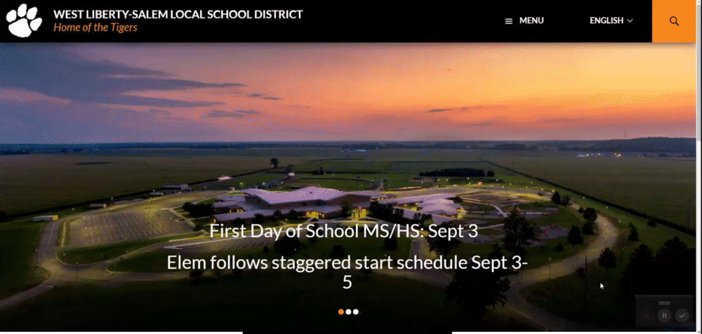
The school has changed their real website for worse! The old website wasn't perfect, but it sure was better than the new one. I like the new website's features, but the theme is awful and the menu is terrible. The old website had the hamburger menu for small screens (mobile) which is fine, but for desktop the menu should be along the top. Another change I quite dislike is the new font. Fira Sans is a really good font, and I really wish they had kept it.
**Note: The mobile version of the website is mostly fine. The changes I am suggesting are for the desktop version of the website. Some of them could be adapted for mobile though.**
The Menu
This really makes me angry. Why on earth does the menu not close then you click away from it? That is really annoying and I quite dislike that. It's really like a mobile website on a desktop. Why does there need to be a separate button to access menu. They should just put the main headings on the top of the page.
The School Pages

Why don't the menu pages have the submenus like departments, student life, etc on the page? It requires 2-3 clicks to get to them.
Events

Why! This is way to complicated. What was wrong with the CALENDAR? I would much rather look at a calendar. Just like the website was before. I want to be able to see months and weeks and stuff like that. The list of events is fine for the homepage, but for the events page I really want to see a real calendar!
Some things I like
Yes, I do like some things. The menu TREE is good, much better navigation tree than before. The concept is good but the implementation (hamburger menu on desktop) isn't.
I like the live feed and news. It can help separate the important stuff from not so important stuff. However, I wish there was an easy way to filter it by department.
The Redesign
Here's my concept for a new design:

For the concept I kept the bottom part the same. It's fine and the only change I wanted to make was change the font back to Fira Sans.


Here's how the menu would work. To open menus and submenus, you need to click or tap on the +, then click on the - or away to close them. When you're on a page that isn't the homepage, to access the links at the bottom of the homepage a hamburger menu would appear to the right of the searchbar and it would open up to look like this.


Since the current website for some reason doesn't have the submenus on the school page, those would be added.


No comments:
Post a Comment